Aspect Ratios in LEMONADE, Pt. 1
29 Apr 2016Ashley note: Super shout out to Peter Oleksik, Assistant Conservator at MoMA, who coauthored this blog post with me, was the impetus for the post existing at all, and provided very thorough factual information that turned my flippant guesswork-notes into real knowledge. Thank you, thank you Peter!!!
Post-posting Ashley note: Second post is now up!
Similar posts:
- Format-ion: Video playback errors in Beyoncé’s latest music video
- Beyoncé’s HOMECOMING: Film, film, and video
Here’s more words at the intersection of Beyoncé and media preservation. (Yeah, by popular demand…) Let’s talk about aspect ratios in Lemonade.
History of Aspect Ratios
First, what’s up with aspect ratios? Aspect ratios are the kind of thing you only notice when they appear outside of the expected norm, unless you are the kind of person that thinks about media formats and standards a lot. Simply, an aspect ratio is the delimited height and length of an image.
It helps to see this visually represented within the context of each other. Here’s a link to some aspect ratios compared c/o Wikipedia.
The earliest aspect ratios came out of paintings which provided 4 right angles in which to “frame” the subject matter. This was then adopted by the theater and the advancement of the proscenium arch, which again allowed for a frame to compose the mise-en-scene of the performance. Photography borrowed from the paintings side of things to again “compose” an image and cinema followed suit to then project this composition in a theater. Think about how film works: light passes through rapidly moving images and casts shadows on the emulsion then, after the film is processed, these shadows are projected onto a screen. To make the basic mechanics of this work, sprocket holes exist on the sides of a very, very long piece of sturdy material (plastic, mostly), thanks largely to W.K. Dickson and his early kinetoscope. The way all of this technology-creation worked out is that we ended up with approximately, but not perfectly, a square. The reason for this is possibly arbitrary, either necessary for the sprockets or coming from a “full plate” daguerreotype (technology tends to build on previous iterations, as highlighted above, so the square was probably inherited in some respect). Over time, technology got better, formats got larger, and sometimes film frames got wider.
Edison took all credit for the kinetoscope and went on to standardize the 4:3 aspect ratio for film projection (well, in the US. There were also standardizations happening around the globe in the early 20th century). By the time broadcast television rolls around, and because engineers are lazy and just go with what came before, standards were being set because lots of systems made by lots of different companies all had to get along. It’s kind of like having to worry about if something is Windows-compatible or Mac-compatible because the underlying systems are intrinsically different from each other. Imagine if you had to buy a different TV to see different broadcast channels – it wouldn’t have taken off very well.
So what exactly does this have to do with Aspect Ratios? Well, with this standardization, the 4:3 aspect was basically “locked in.” However, Hollywood, fearing TV as a competitor, started to push the boundaries of the ratio into wider and larger formats. This’ll become more important later when these ratios start to become integrated into the 4:3 (and later 16:9) aspect of video (analog, and more importantly, digital).
You may be asking yourself at this point “uh, I thought this was about LEMONADE”? We’re getting there, but first, a brief explanation on why LEMONADE is so formally interesting. As you may have gleaned from the previous few ‘graphs, aspects adhere to standards and artists worked within the confines of them, choosing a ratio that suited them best for whatever they were trying to convey. This was important, as described above, because of the need of interoperability and aesthetic conformity (all TV sets are pretty uniform). However, we’re at a unique moment where we have a smorgasbord of ratios to draw from, and with displays shifting in their shape and size, we’re seeing ratios tossed into a blender and delivered up without a care about black bars obscuring the image or images stretched to fill a screen. LEMONADE is a perfect example of this “devil may care” attitude with ratios, using them to suit the stylistic purpose rather than making it fit a particular screen (is there even such a thing anymore?).
We’ll strive to talk about the aspect ratios used here and where they were used in the past and why they were used, but I’m not going to integrate any theories as to why the directors have chosen to use these aspect ratios, but feel free to do that yourself (that kind of speculation is at least another full blog post’s worth).
Mechanics of Aspect Ratios
Aspect ratio dimensions are typically displayed in two ways. In the first style, 1 is the height of the image and the first number is the width in relation to the height, with 1 as the base. 2:1 means that the image is twice as wide as it is high. But it’s also common to read aspect ratios in an easier-to-read format such as 4:3. 4:3 and 1.33:1 are the same concept, just represented differently. This is obvious to your average 5th grader, but this is easy to forget about when you’re a person who hasn’t had to “math” anything in 20 years and aren’t thinking about these numbers in the context of mathematical representation.
So, representing an aspect ratio as 4:3 or 16:9 is just a more simple way to understand the same equation. They are used interchangeably, but some numbers break down cleanly and others don’t have an easy fraction. For example, 4:3 and 16:9 are easier to remember and type than the way their ratio breaks down in relation to 1 (1.33:1 and 1.77:1, respectively, with the training decimal of the first number continuing into infinity). A widescreen ratio like 2.35:1 is only going to break down to 47:20, which isn’t more pleasant to say than 2.35:1.
All of this to say that for the sake of consistency and clarity, when I talk about ratios I am going to primarily use the number broken down as it relates to the constant of 1.
Finally…Ratios in LEMONADE
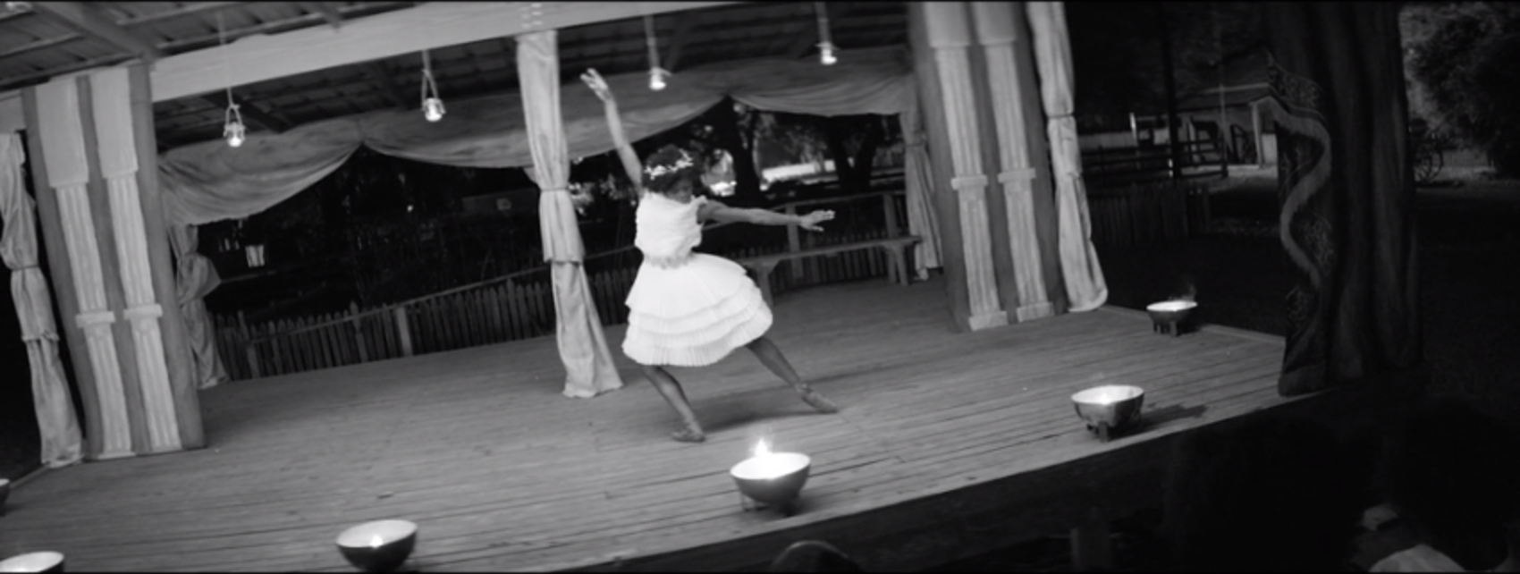
OKAY, let’s get into this visual album masterpiece, LEMONADE.
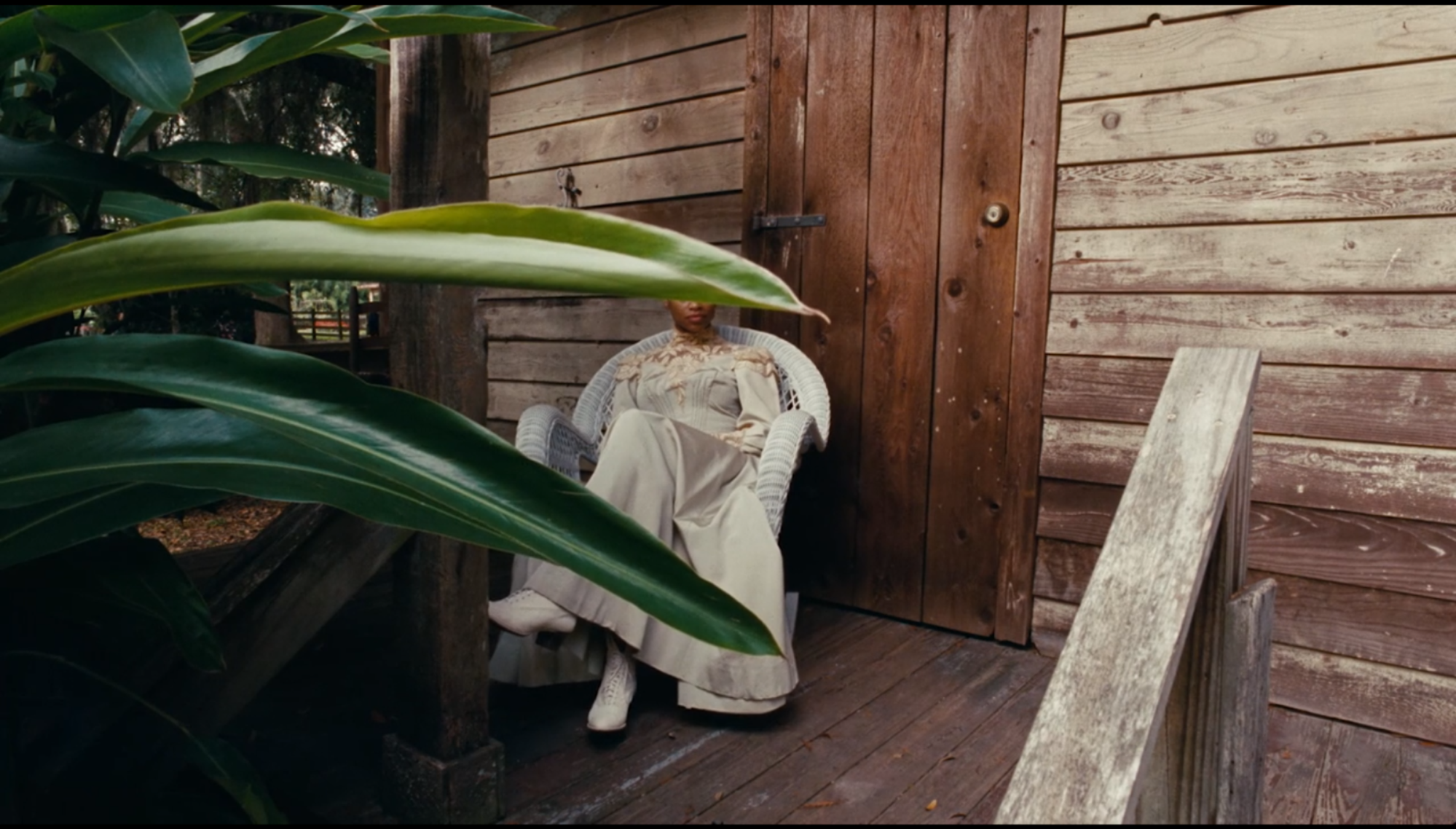
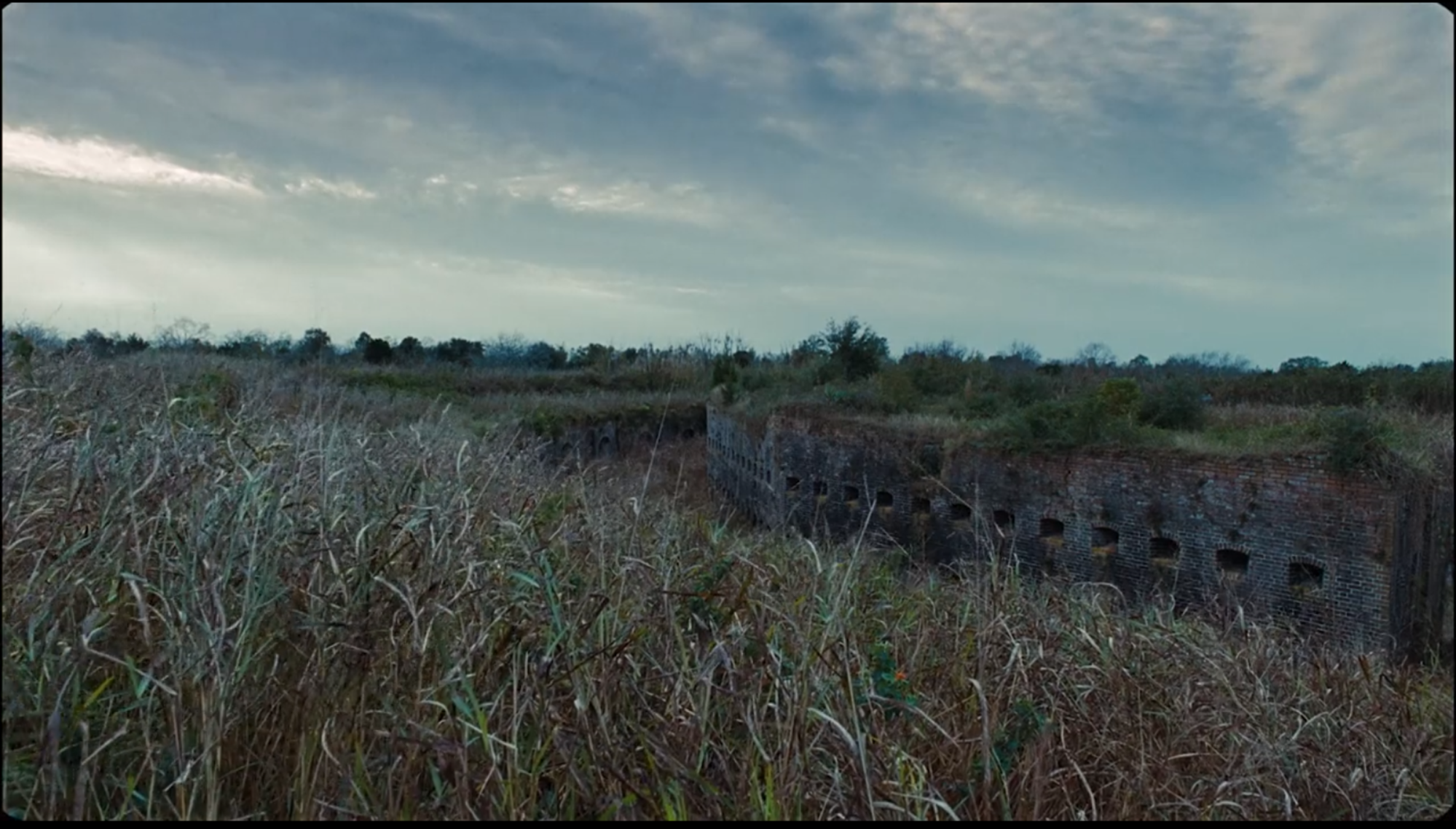
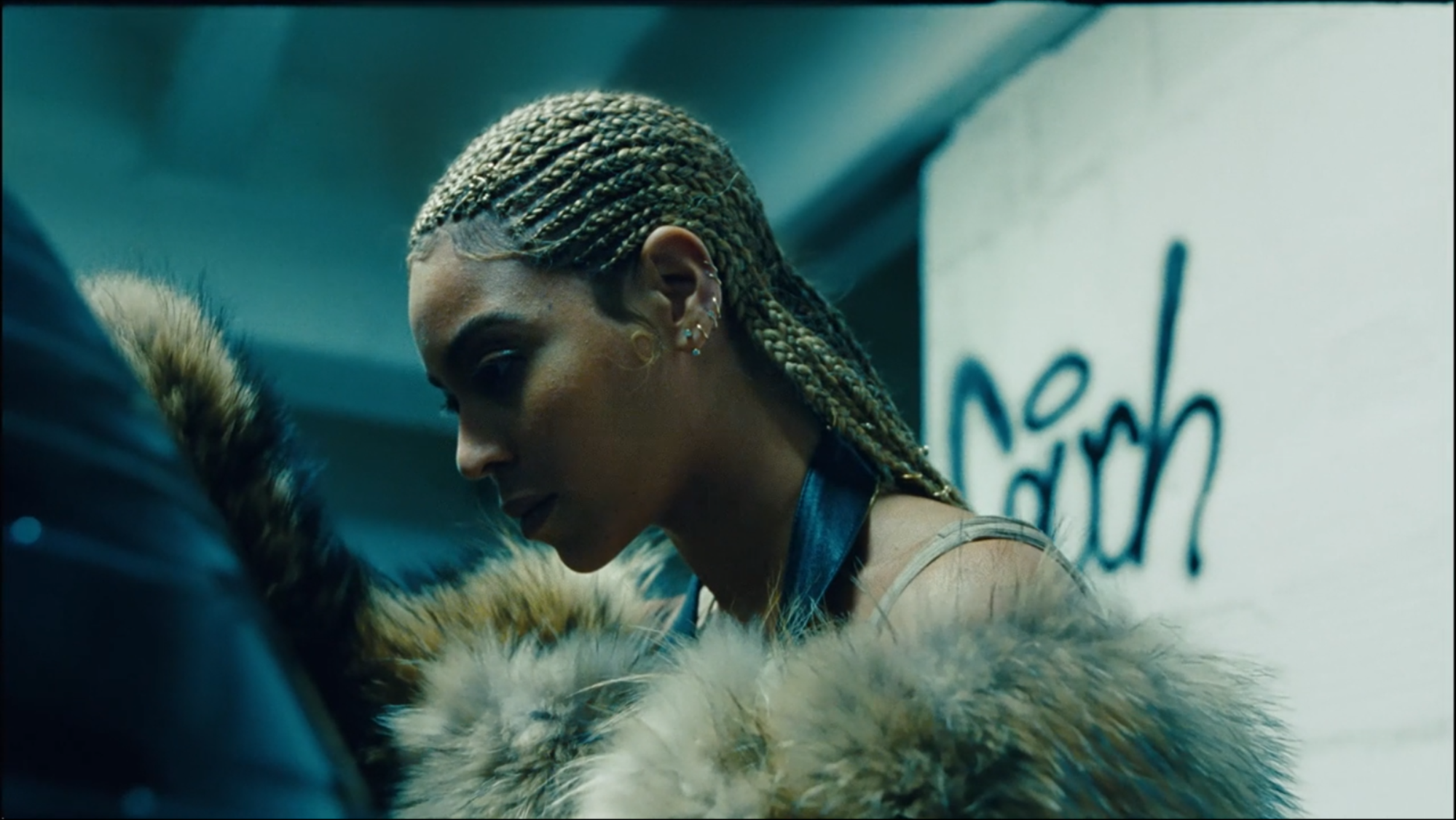
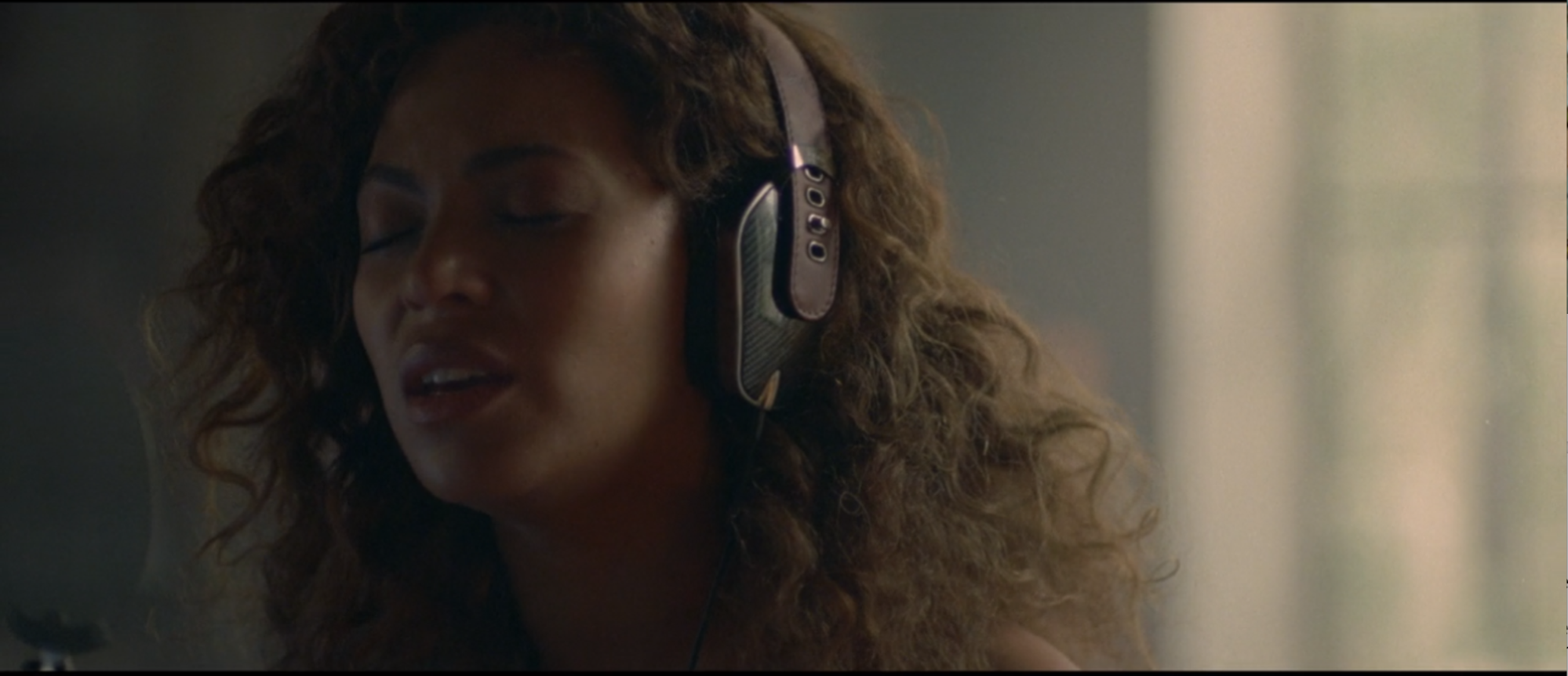
The album starts off with a 2.2:1 aspect ratio. This is used as the standard in 70mm film (as mentioned above, widescreen formats were originally created to compete with the TV in the homes in the 1950s, but now are de rigueur in video as you’ll see below). The video here, though, was shot digitally and cropped to this ratio later (this is common in cinematography to compose for one aspect ratio when shooting in another). Which makes sense, because footage from this same shoot shows up later in different ratios. Anyway, 2.2:1 is wider than what was historically considered to be “widescreen” in United States cinemas (1.85:1) but less wide than the modern “widescreen” cinema screen (2.35:1). This is also slightly more cropped than the 2.33:1 aspect ratio (also known as 21:9) used as the ratio in contemporary television and computer screens.
This opening shot lasts 15 seconds and we don’t see that size again for the rest of the video.
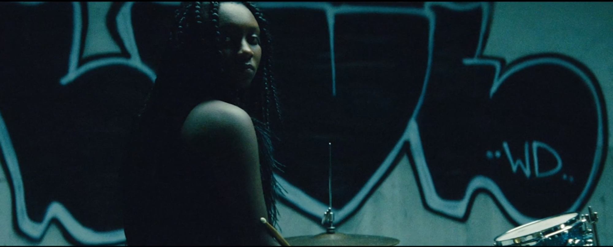
For the second shot, we go even wider at 2.667:1, representing an aspect ratio of the widest possible lense range for Cinemascope (“full/silent”). Full/silent is because it’s at the maximum potential width and silent because audio tracks recorded on film take up space, typically the reason for the difference between a 2.667:1 ratio and 2.55:1 in the context of Cinemascope.
The third aspect ratio we see is 1.77:1 (or 16:9), which is the aspect ratio for the presentation of most HD television/video (nerd tangent: Dr Kerns Powers came up with 16:9 as it’s the mathematical mean of of the extreme ratios (4:3 and 2.35:1) Initially proposed as a compromise, this has become THE aspect ratio of the present). This is the aspect ratio most frequently used on the album. It also conveniently fits perfectly within Tidal at full screen on a MacBook Pro or an HD television streaming HBO, which are the preferred viewing methods. This is the new “full screen” in terms of the aspect ratio of most screens currently being sold today.
Did you miss this completely when watching Lemonade for the first time? That’s not at all surprising because these three aspect ratios hit us in a span of less than 30 seconds (and half of that time was the opening shot)!
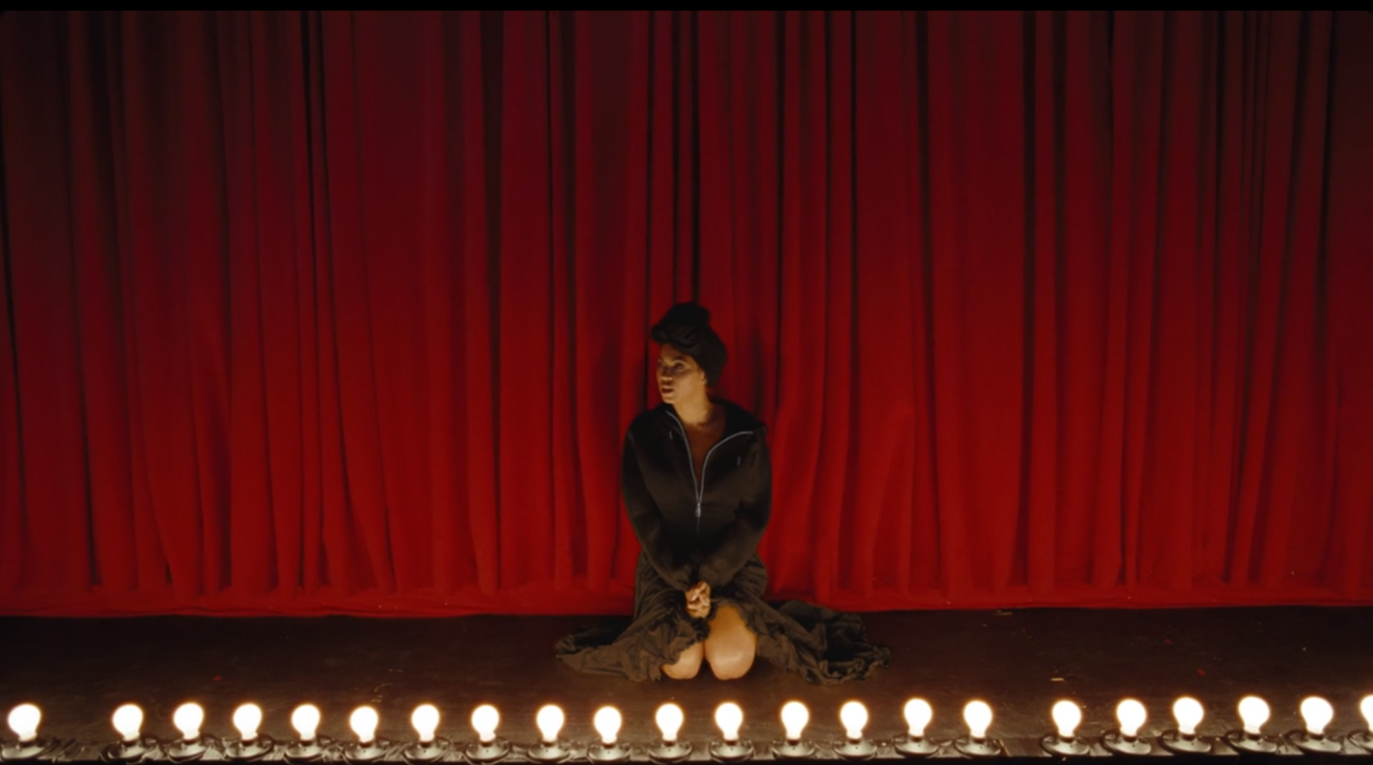
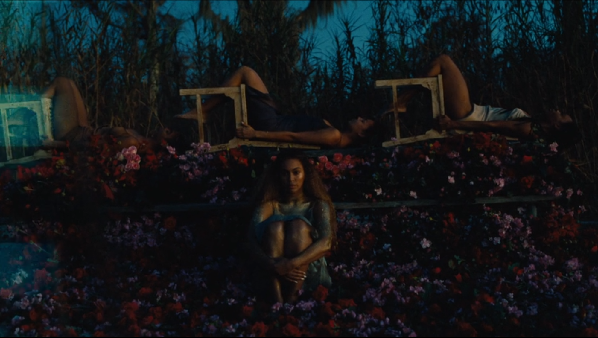
Then just when your head is spinning from so many sizes of images all at once, the album goes totally wild by throwing in a mega-wide 3.5:1 ratio! Whaaaaattttttt!!!
I don’t even know how to talk about 3.5:1! It’s just SO WIDE. It is unconventionally wide.
Robyn’s Call Your Girlfriend is pretty close, coming in at 3.35:1 aspect ratio. Tangential, but this song is the opposite to the narrative Beyoncé is singing about in her album. Call Your Girlfriend is about telling the dude you are sleeping with to tell his girlfriend about the affair because it’s over between them. [Ashley note: I really like this song but I also think it’s incredibly rude and it will make me cry if I think about it too much.] Sorry, Robyn. Maybe Beyoncé just needed to take it a step further here.
After settling into these rapidly rotating ratios for a little while, along comes the “standard video” square image of 1.33:1 (4:3), historically the aspect ratio of all television up until a couple of years ago with the official crossover to HD television when broadcast networks adopted it across the board in the early 2000s.
Later, during “Don’t Hurt Yourself,” we return to a shot very similar to the opening, but the ratio is at 1.77:1.
See how similar they are, but with different ratios cut in post?
Some of the subsequent shots cut down to 2.48:1.
And goes back to 2.667:1 again.
The more-square 1.33:1 (or 4:3) ratio is used throughout, same as the above “standard definition television” but meant to represent a “home movies” feel.
However, we are going to save this for the next blog post which focuses on home movies and aspect ratios in the video based within that context.
Something else to note: “Sandcastles” is the only song segment of the album that keeps a steady framerate for the entirety. The ratio is 2:35:1 (widescreen/Cinemascope).
So that’s the aspect ratios in LEMONADE. As pointed out to us by Seth Anderson, this isn’t the first example of Beyoncé’s aspect ratio weirdness
To follow up with the “Formation” blog post, we do see some added format “errors” a few times, although much more sparsely than in “Formation.”
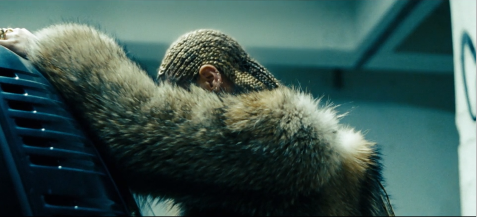
The most noticeable errors happen during “Love Drought.” There’s some emulsion scratches, light leaks, and off-balanced film sprockets (due to the film wind being too loose, the sprockets being broken, or the film being warped/shrunken/damaged). This (manufactured) error is similar to an error that could happen as a result of water damage, causing the film to warp and for the color printing to fade. It also looks like a light leak, but turning a tinted blue-green instead of an expected color (red/white).
Something to note is the frame line at the top of the image, so this is zoomed (presumably 35mm) or a fake frame line.
These beach-with-a-buddy scenes also have the visible frame line with more noticeable, irregular shadows along the top of the frame.
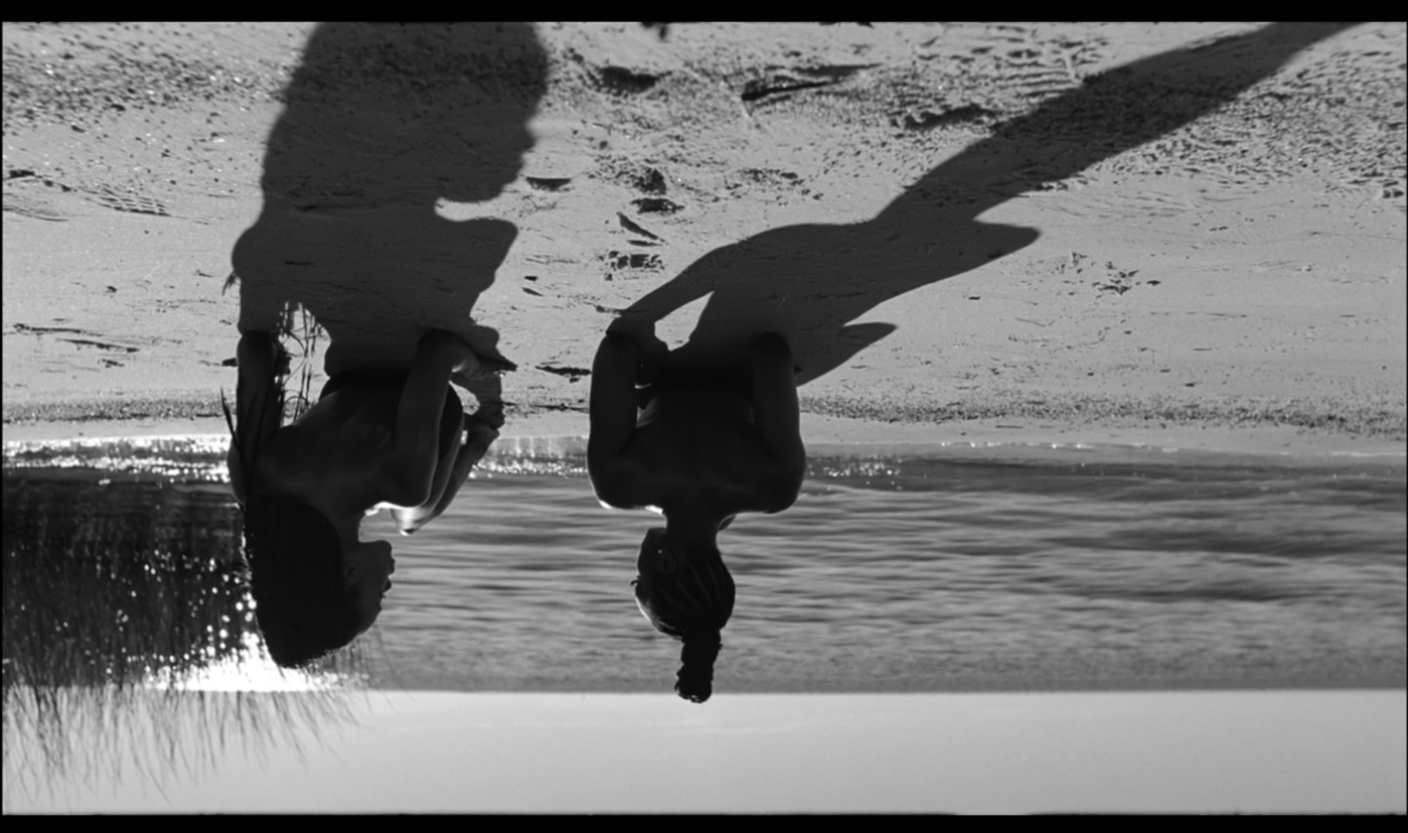
This camera has a bit of a “fisheye effect” going on with a very specific focal point in the middle. Parts of the shot that should be straight lines are curved more than usual and the edges of the frame are blurry. This is (likely) from a wider-than-average lense on the camera when recording these scenes and not something done in post-production.
Next post goes into the specifics of the different kinds of personal home movies seen at the end of the album. And just like last time, please direct corrections to the Issues page or reach out directly, maybe on twitter, for comments and discussion.