CSS Grid and New Order
03 Oct 2017Hi! 👋 I gave my website a makeover. I gave it many makeovers! Here’s how that went for me last Sunday, bored and unwilling to do actually-productive and meaningful things. This is what I did and a love letter to CSS Grid Layout.
Before
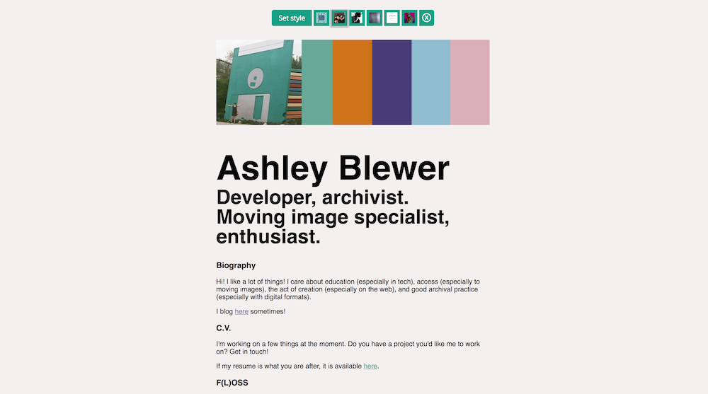
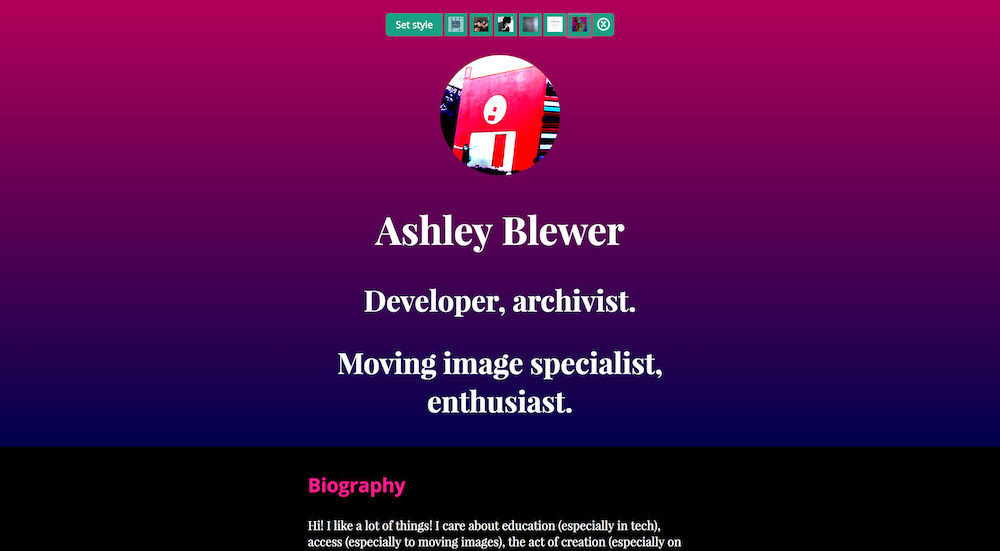
First, here is what I was starting with, my previous website. Fine, minimal, Josephin Sans and Open Sans courtesy of Google Fonts, with skeleton for a CSS framework, normalize.css on top of that, and some light customization on top of that (link colors, et cetera). I didn’t need that framework though, even though it is pretty and the filesize is petite.
So I stripped the site down to essentials, plain HTML. I fixed some structural issues, but overall things were already looking fine because the site is just, like, a series of paragraphs and lists with one image at the top starring me at the Pop Century Resort, 90s Section. I then added a bit of CSS to get my own basic framework in place, based on CSS Grid.
If you don’t know about Grid Layout, it is the best. I wanted to rejoice in Grid and other CSS3 features that are now functional across browser platforms, because laying out pages and designing for the web has FINALLY caught up with the way my brain thinks about things, which is from pen-on-paper and my traditional print-design education, obsession with Adobe Illustrator, structure, honoring grids while breaking them, whitespace, typography, et cetera, whatever. Here is a guide put out by Mozilla for learning more about it. This Complete Guide to Grid is good, too.
Anyway, I’ve been listening to a lot of New Order, and it also sort of felt like New Order songs were chasing me around every bar in the New York metro area for two months. Inescapable. When the season started to change at the end of summer, every year for years I would only want to listen to Boston twee pop band Pants Yell!. This time, it’s New Order, and I like to think that signifies some sort of deep emotional maturity in me, like when I was told in college that I had to be at least 30 to appreciate 10cc songs (this turned out to be true) but I don’t think it signifies anything at all. The point of this paragraph is New Order was in my head, so New Order it is. Honestly, I didn’t put a lot of thought into it because I was ready to make it happen.
Constraints
Next, I piled on the design constraints, which is the easiest way to get myself to chill out and actually focus on the task at hand.
- CONTENT: I dedicated myself to tackling the first six New Order albums, so I could eliminate the stress of thinking about how much I liked some of the others but also saved me (because I counted Substance) from having to look at the Republic cover ever again.
- SPACE: I can’t modify the HTML structure just because it’s convenient. I also can’t add images because it helps.
- TIME: I want to start and finish on Sunday and not exceed Sunday and also do other things on this day.
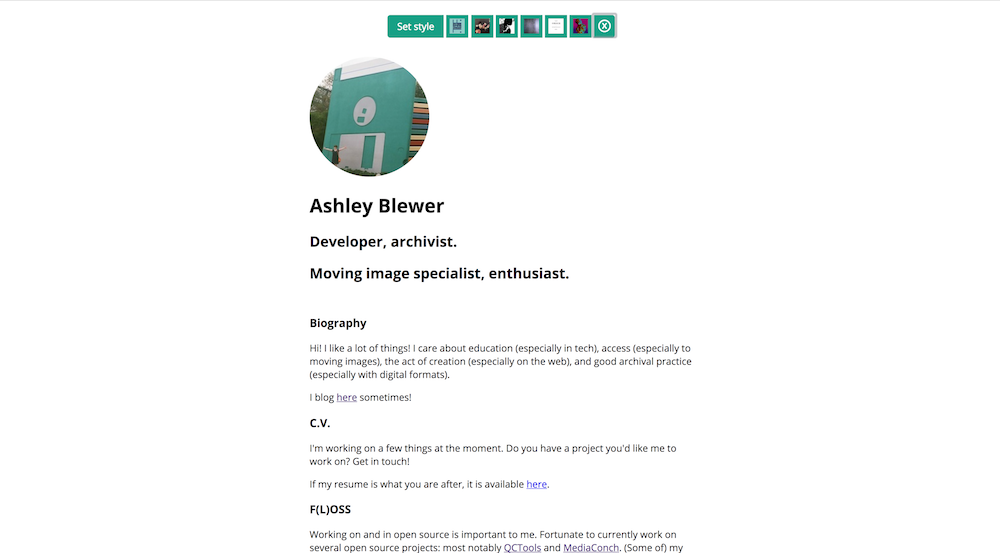
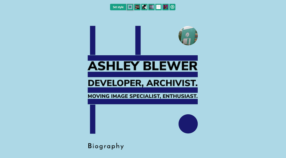
Action
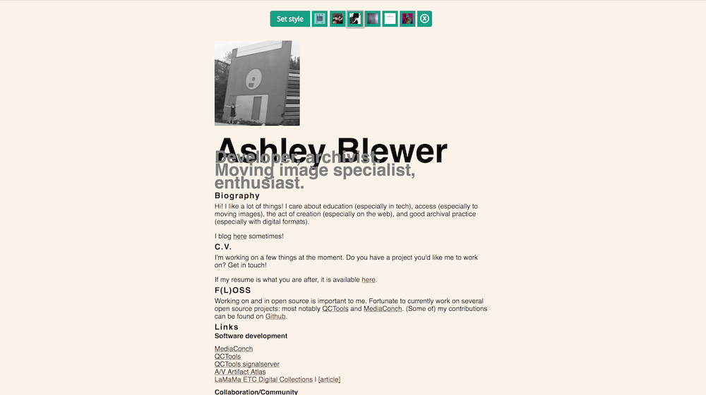
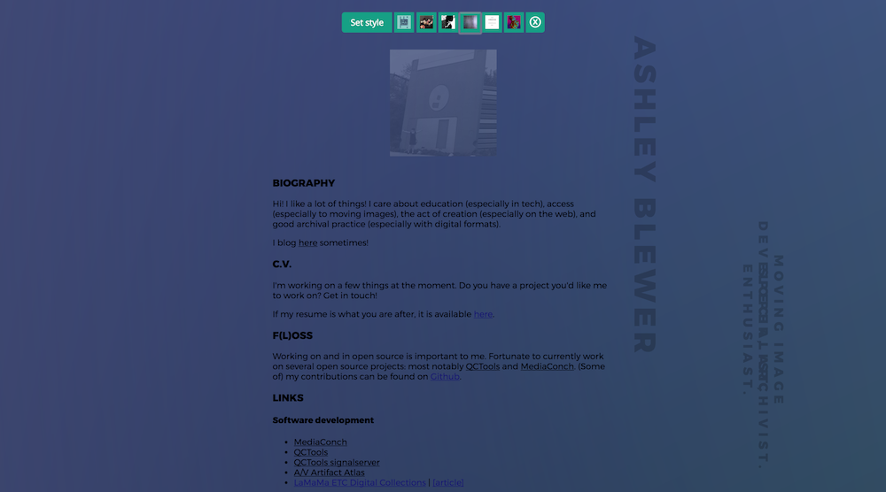
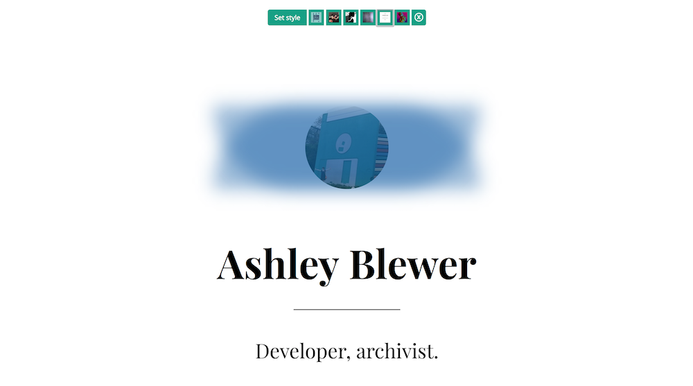
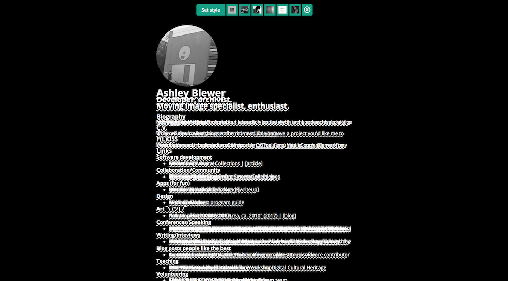
So I got to work! I spent a lot of time on Movement, because it is beautiful already, and not a lot of time on Brotherhood, because I thought it was ugly no matter what I did to it. In a lot of ways, I relied on what happens “above the fold” in the introduction portion of the website and I focused a lot of trying to assess which font that I could easily (lazily) integrate for free that would match the liner notes of each album. For the image-heavy album covers, especially Power, Corruption and Lies, I had to focus on the minimal elements of the design itself, since I constrained myself to not adding anything else, including sneaking images in through CSS. This also made Brotherhood difficult because I had to figure out how to do a metallic effect without adding any texture, and instead had to rely on CSS gradients happening all across the page.
After feeling accomplished (enough) with the layouts, I then had to make them work with clicking actions. I added a super tiny bit of javascript for this:
for(let btn of document.querySelectorAll('.makeover')) {
  btn.addEventListener('click', (e) => {
    document.getElementById('neworder').href = "css/" + btn.id + ".css"
  }, false);
};
And it was all good! I spent way more time than anticipated configuring the taskbar that I set at the top of my webpage into actually looking not like garbage, and unfortunately it still kind of looks like garbage (both at the front and underneath in the codebase). I was getting annoyed and impatient, because it was at the end of the day and the fun stuff had all been done already, otherwise it might look better. Maybe it will look better one day.
And then
At the end of all of this, I posted it on twitter because that’s what I do when I have completed a minimally viable product and want people to see it and maybe make it better, because I never do anything that isn’t open source unless I am forced under capitalism to do so (cats gotta eat). One friend of mine, Travis, jokingly asked where the Unknown Pleasures easter egg was going to be, and I went into a witch-cackle laughing frenzy until it came into existence, which took only a few minutes. I won’t tell you where it is, but it’s also pretty obvious. I also had forsaken using viewports to trick the Movement stylesheet into working well, but I ended up making it come back so things resized better on phones, and then had to patch the kinda-shady methods with which I was causing things to come together, but it was imperfect. Another pal, Aidan, who happens to be a designer-who-misses-CSS, seemed to be bored enough at work to fix some problems for me, including the aforementioned one, which is ideal. It’s nice to collaborate and iterate!
What’s next?
Yeah, like, this could get way more slick, I just didn’t want to keep spending time on it. Like, soft animations can go a long way in making the site more polished and more welcoming, so I’d like to add some of those. I also still want to add the U.K. edition of Ceremony which I think is really visually appealing in a way I’d like to make work on the web? I also tested this on three browsers, desktop and mobile and mobile-simulation, but I’m sure things fail in “edge” cases (Hey, is that why Microsoft rebranded IE in that way? Genius.).
Thank you for reading!